As a professional sign company, we see a lot of things that don't follow general design 'rules'. Sadly, some of those people that break the rules are from other sign shops.
But rules are made to be broken, right?
Well, no. Rules are there to keep everything on an even keel. Rules are guidelines that have been largely conceived from a lot of trial and error. Rules are, well.... rules.
Speed limits are a prime example. If a road has above average road accidents, the first thing authorities will do is lower the limit. The new speed limit is essentially a new rule for that piece of road. The second thing the authorities do is hide a radar trap in the area to catch those drivers that don't think rules apply to them... but that is another subject entirely for another day.
Rules are in everything. Parents have rules for children (You can't watch TV until you've done your homework). Employers have rules for employees (You can't smoke in the canteen). Governments have rules for their citizens ( You can't disobey a rule without paying a penalty).
But what has that got to do with design errors I hear you ask somewhat impatiently.
It is important to realise that good readable design also has rules. Tried and tested rules that define a good design against a poor design. If you ignore the rules, your message will probably be totally lost because people are more likely to concentrate on the confusing design more than the message.
Some DIY design errors are more common than others.
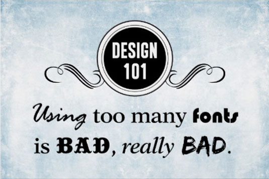
One design rule that is often ignored is the use of many fonts in each sign or poster.

Craig Minchington, in his article for Creative Blog, points out correctly that too many fonts just clutters the page and makes it harder to read. Two fonts and several weights are the general rule in poster and sign design.
Another rule often broken is coloured fonts on a coloured background.

Simone Sala points out in her blog 'Typography cheat sheet' that a general mistake is to use two tonalities that are too much similar to the point that distinguishing the words from the surrounding becomes very difficult. While this is irritating for most users, it’s generally a show-stopper for anyone with vision problems.
By far the most common mistake we see is the wrong font choice. This would be the rule that is broken on a daily basis when producing a DIY poster or certificate in-house by most DIY designers.
So what is the rule?
The rule is simply this - Never use a script style font in all capitals. With few exceptions, a script style font should only be used in an upper (Capital) and lower case format. It not only looks untidy but the spacing is nearly always wrong, especially when a flowery or feminine style is used.
There are some beautiful scripted fonts available, but they were never, by definition, designed to work as all capital letters in headings or definitive text.
Another problem with most scripted fonts is that some ethnic groups that don't speak English as their first language, find these styles much harder to read. If you are doing a poster with an important message and the headings are all scripted capital letters, it is a fairly safe bet that the message will be lost on any reader who has poor eyesight or who has a poor grasp of the English language.
 So next time you are entrusted with using Word, Illustrator or Coreldraw to produce that certificate congratulating someone for a job well done, spare a thought for the readers who will have to see the thing week in and week out on the staff room wall. At least make it easy to read and not an assault on the eyes.
Lets all make sure that, if we are the person given the weighty responsibility to design a well deserved award certificate, we take that very seriously and we think of the reader as well as the recipient.
One is no less important than the other. More importantly, think of the poor sign person who has to look at the all capital script. They often lose the will to live just a little bit every time they see it. It's not something that we'd want to be responsible for I'm sure.